Wendy’s Rewards
Fresh, never Frozen.
Discover Process
Audience
Wendy’s App users
Role, Timeline, and Deliverables
UX/UI Designer
3 Weeks
Competitive Analysis, User Interviews, User Personas, Empathy map, Journey map, User Stories, Storyboard, Paper prototypes, Wireframes, Prototypes, Usability testing
Overview
The proposal from the client was very simple yet difficult to achieve due to redesigning a system in an app created from an enormous franchise. The client wanted me to redesign Wendy’s Redeeming system which was two different pages one being scanner and another being rewards. The client wanted it to be one singular page that has an always-on screen scanner so the scanning process is very quick without having to take the customer’s phone away to do the scanning.
Problem
Wendy's has always been a fan favorite fast food service place with the most amazing food I have had since I was little, but when it comes to app design they have always lacked accessibility and structure. My clients who are owners of one of the Wendy's near me wanted a redesign of Wendy's Scan and Rewards system on the app. They wanted one singular page on the app that will handle all of the rewards with extra features.
Business Requirements
Easier to scan the code with a present QR code always there.
Add items as cards that show what the coupon is.
Has a more detailed description with the primary information highlighted?
Keeping the same branding, but just better structured.
Solution
The solution that I came up with that had been in the plan throughout the project was first to know what the client wanted. This was first most important to have one page instead of two separate pages like the rewards and scanner page beforehand. The one page would hold the scanner on top with the rewards buttons under them. The extra features to be added were stickers for customer return rates to go higher, discounts for students and seniors that want to be fast in the drive-thru, and getting free rewards when reaching a certain amount of points. Some things that were changed were the scanning for physical coupons to become a feature through the actual phone screen where when scanning the barcode will take you to the app that will show a popup of what you just redeemed.

Research Process
Is where all of my research was conducted using various research methods such as user surveys, interviews, and user stories. All the data I got was used for the betterment of the app’s final proto
User Interviews
Interviewer 1
This interviewer had some bad experiences with the app when using it because they are in an older age (58) group with a desire to use the app and modernize themselves but are annoyed by how complicated the app can be currently.
Interviewer 2
This interviewer has used the app multiple times, but always is annoyed because They have to earn so many points to unlock different rewards and wants a way to earn rewards when you earn a certain amount of points. Has had issues with the two-step version of the QR Code scanner. (30)
Interviewer 3
This interviewer has a lot of experience with the app because of their age (18) Are in two techs so they understand the app easily, but knows that the current structure is way too slow and lacks accessibility for anyone new.
Competitive Analysis
These were the 4 main competitors to take away all the valuable information from. We needed to figure out what they had that would be a treat to our redesign and what is something we could do that would put these competitors miles behind our new rewards system. For the most part, the only thing they had better was the structure and how easy everything was laid out. The best and hardest competitor had to be Dutch Bros with their modern and fun app design that lured customers in wanting to use the app daily.
Empathy Map
Learning about our users' feelings when doing anything through Wendy's system of the app and drive-thru. This was based on one of our user interviews and how they would interact with the different senses of thinking feeling, hearing, seeing, saying, and doing.
Journey Map
This journey map was based on one of our interviews with Adam Morningstar. The scenario was on He wanted to get food on his lunch break, yet still wanted to save money when ordering at Wendy's. In his solution scenario, he uses Wendy's app to get some money saved. This was made using the solution presented earlier and how it would work in the play of someone's journey through the drive-thru using the solution redesign.
User Stories
User Personas

Develop Process
This is where all magical design happens. We start off with the basic user flows and sitemaps for the app then follow up with paper sketches to gain fresh ideas.
User Flow
Storyboard
Sketched Wireframes
Solution Sketches
Crazy 8 Wireframe Ideas
Digital Wireframes
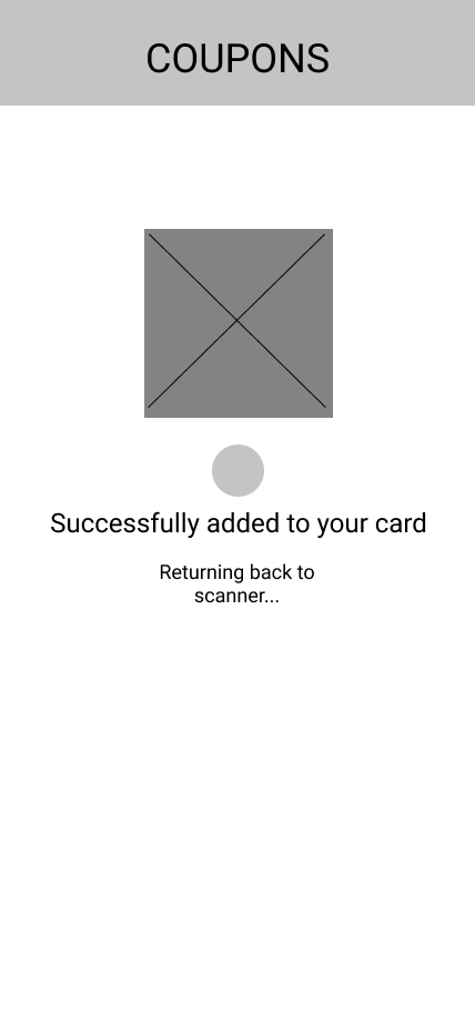
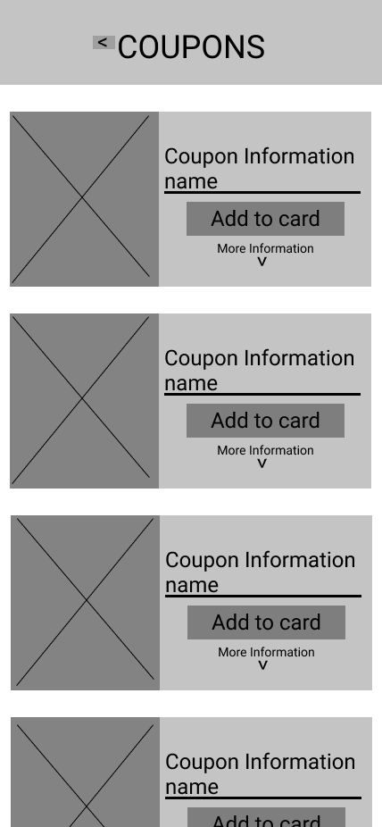
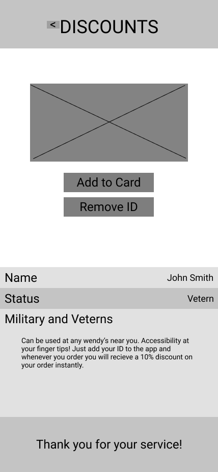
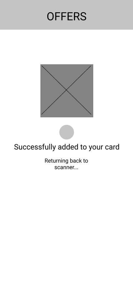
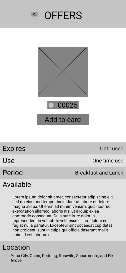
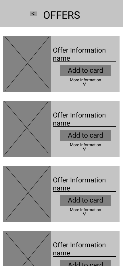
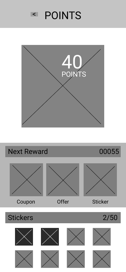
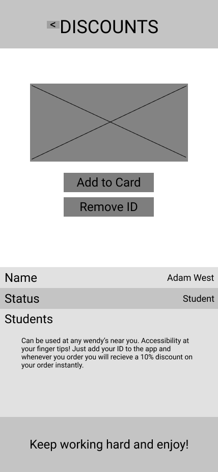
These sketches were small detailed ideas of what I had envisioned the app to look like during the wireframing phase in Figma. I used my research to add features the users wanted and used the business requirements and the user stories needed. The wireframes turned out to be amazing. They were easy to understand and link together with only minor adjustments to be made once we moved on to the usability testing.




Design Systems
Iterations
Usability Testing
Who did we test?
5 participants between 18-45
One Manager
One General Manager
Our Client
What did we test?
What the user did to get to where they desired?
What they thought about all the features?
Where they thought some stuff might be?
Their recommendations on colors and typography sizes.
Accessibility on all the pages.
If they used features added like swiping left to return back a page.
Seeing if they scrolled on scrollable pages.
Prototype
Here is the most latest prototype of the Wendy’s Rewards Redesign in all it’s glory.
Try out the app!

Deliver Process
Lastly we come to the conclusion of a beginning for the how we would make this amazing redesign into a reality for everyone.
Conclude
-
The main process for this redesign for Wendy’s Redeeming system would be extremely different compared to actually launching an app into public or giving a company your work for integrating the actual prototype into a real app. For the future of this redesign, I would first present everything I have done including research and irritation to my client for the final yes. After I am given the all-clear, I plan to present the project to the District Manager of the Wendy’s I have made the redesign for and if I’m given the all-clear from him I can then reach out to Wendy’s Franchise with the project to be given a chance of becoming an actual integration on their app. This is a very difficult process because Wendy’s is a huge Franchise company that gets projects like this daily and for them, my project may just be fan art because they might want to remain professional with their high level designers that they have hired to do the job.
-
The conclusion to the rewards app was to merge the scanning into one page to make it much easier to access and remove the confusion of having two separate pages for no reason. I discovered that Wendy’s app had the rewards and scanning as two separate pages and the rewards page was just to see your points and to unlock different ones from the store. I had to redo some of my ideas and research to make them much more relatable to the change in the previous design. The MVP stays the same which was to make a simple and easy Rewards page for Wendy’s that will allow users to add coupons and offers to their scanners which could be unlocked using points and points unlocking system to unlock coupons and offers and making the scanner be always on the screen instead of a two-step feature.
-
The most challenging part of this project for me was figuring out how I wanted the redesign to be without taking too much out of the original and also not keeping it the same as the original. It was by far the most mindful experience where I had to take serval different pathways to uncover all of the different research methods and to truly understand the targeted users. In any future redesign, I would love to make my branding instead of trying to stick to Wendy’s Branding just to give the clients more room to work with and present more options to the clients. All these takeaways have helped me gain a lot of knowledge in how amazing a redesign can turn into.
